Progress Alberta
Progress Alberta
Logo and branding update
Progress Alberta is an independent non-profit that does political and community organizing, training and research. They launched in January 2016 with the goal of building a genuine, people-powered progressive movement in Alberta. They believe that no matter who’s in government, if you don’t have a large, organized group of people calling for positive change you won’t get it and that politics is too important to leave to political parties – a strong, engaged group citizenry is key to a strong democracy.
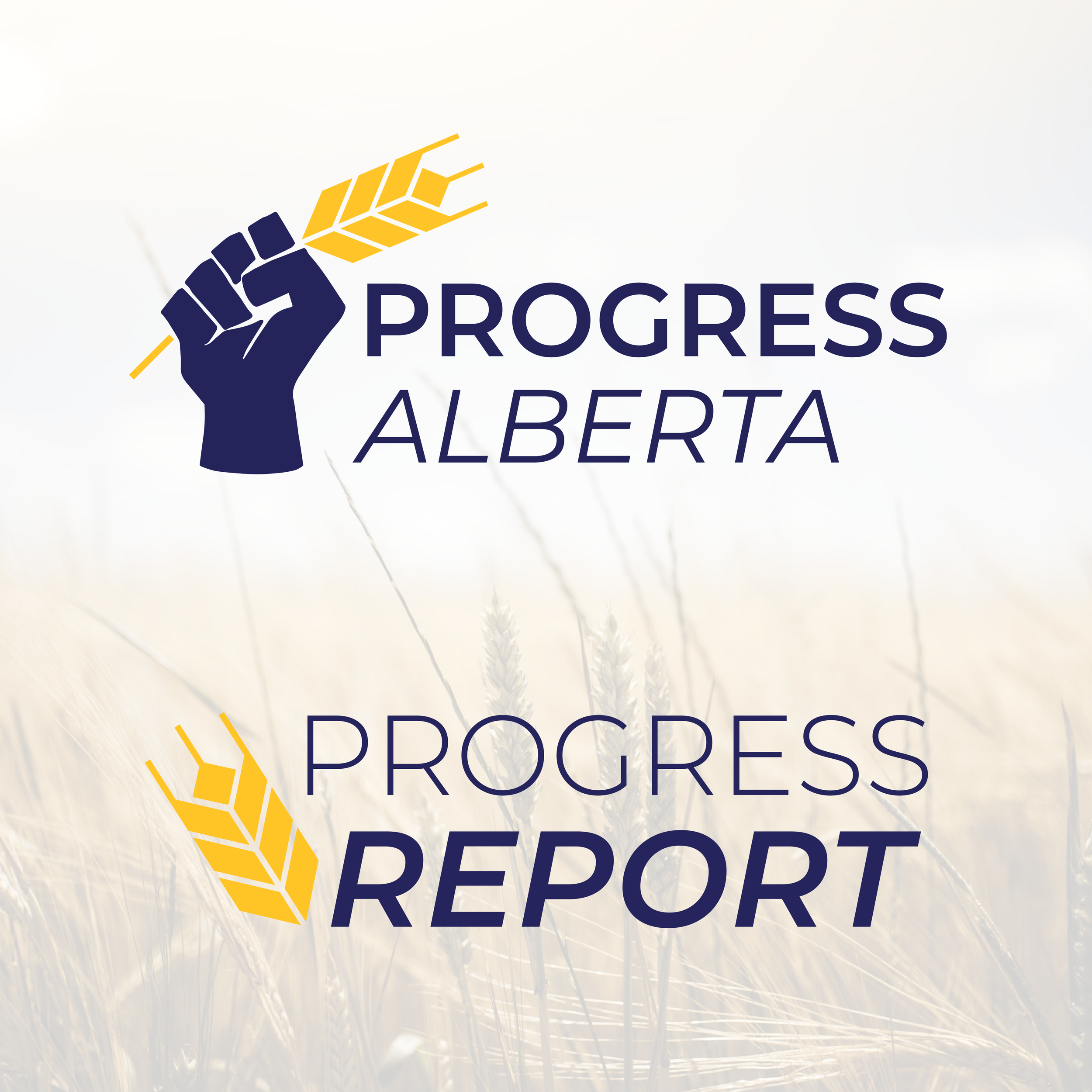
Logos
Progress Alberta brought me onboard to update their existing branding – they liked many of their existing brand elements, such as the colours and wheat iconography. They requested a refresh of their Progress Alberta branding and a logo with a strong family resemblance for their podcast, the Progress Report.
When we discussed iconography that we wanted to work with, incorporating the geometric wheat motif from the old branding was a key consideration, as well as bringing in a classic solidarity fist element. We felt that the role Progress Alberta plays within the community, it made the most sense for that logo to feature the solidarity fist holding an updated version of the geometric wheathead. For the Progress Report logo I worked with their old logo, updating the angles and typography to complement the new Progress Alberta branding.

Social Media Graphics
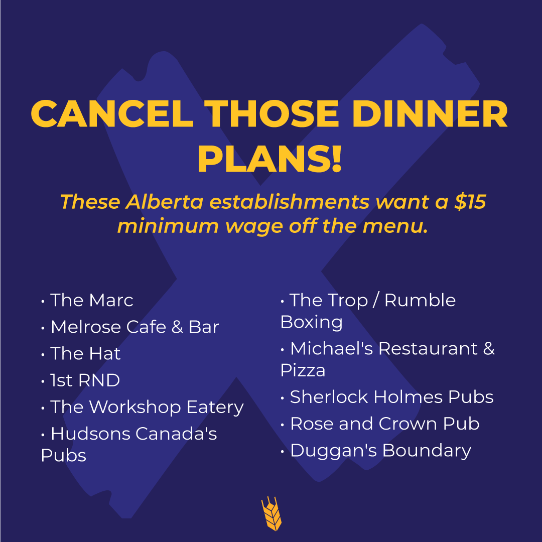
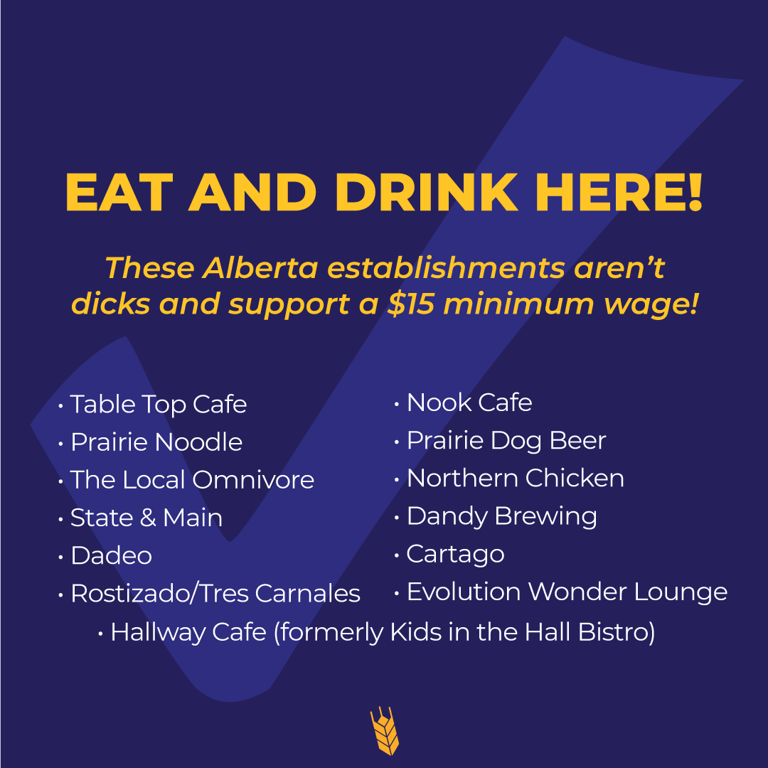
In response to media stories regarding wage roll-backs in the restaurant industry, Progress Alberta requested some social media shareables to “name and shame” restaurants that had gone on record in favour or opposition of a $15 minimum wage. They provided guidance for some cheeky and playful copywriting, which I paired with simple, clean background elements. The graphics were a hit, gaining a lot of shares as people sought to support their local restaurant and hospitality workers.
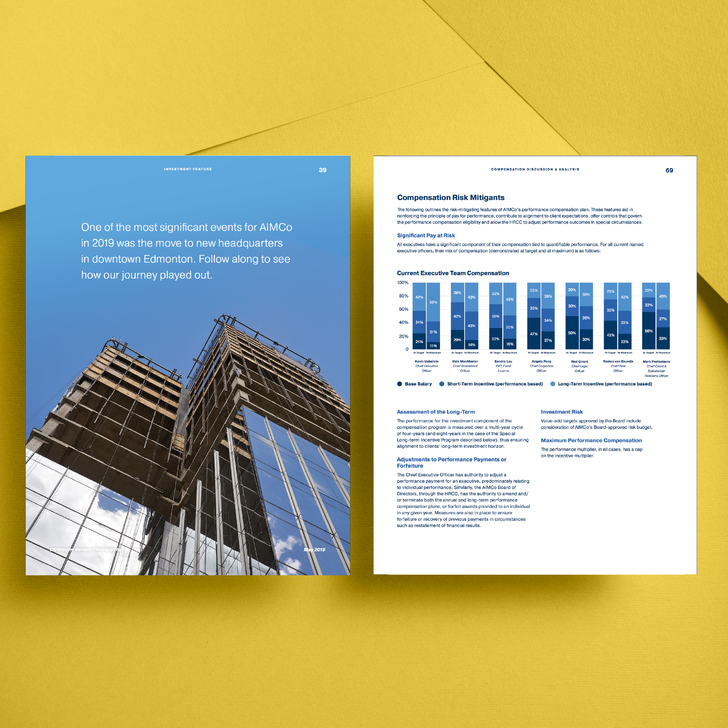
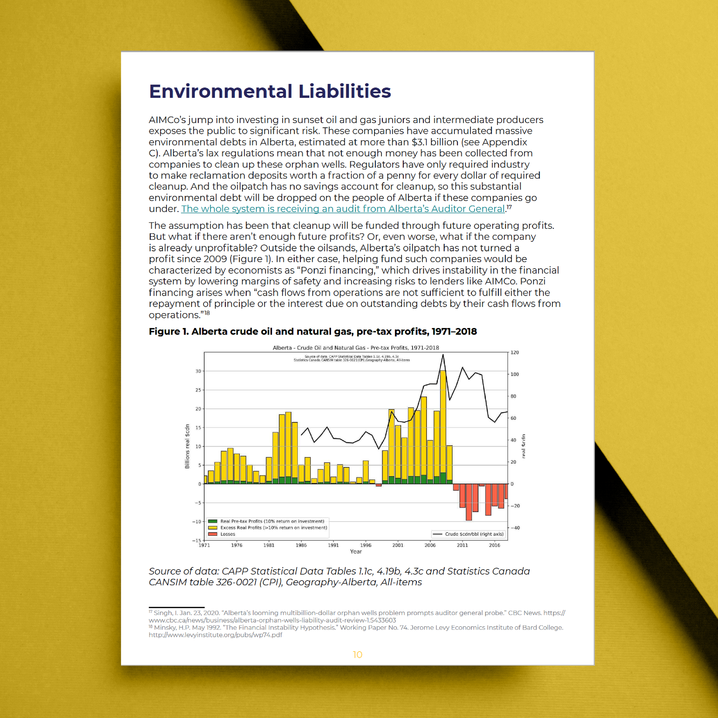
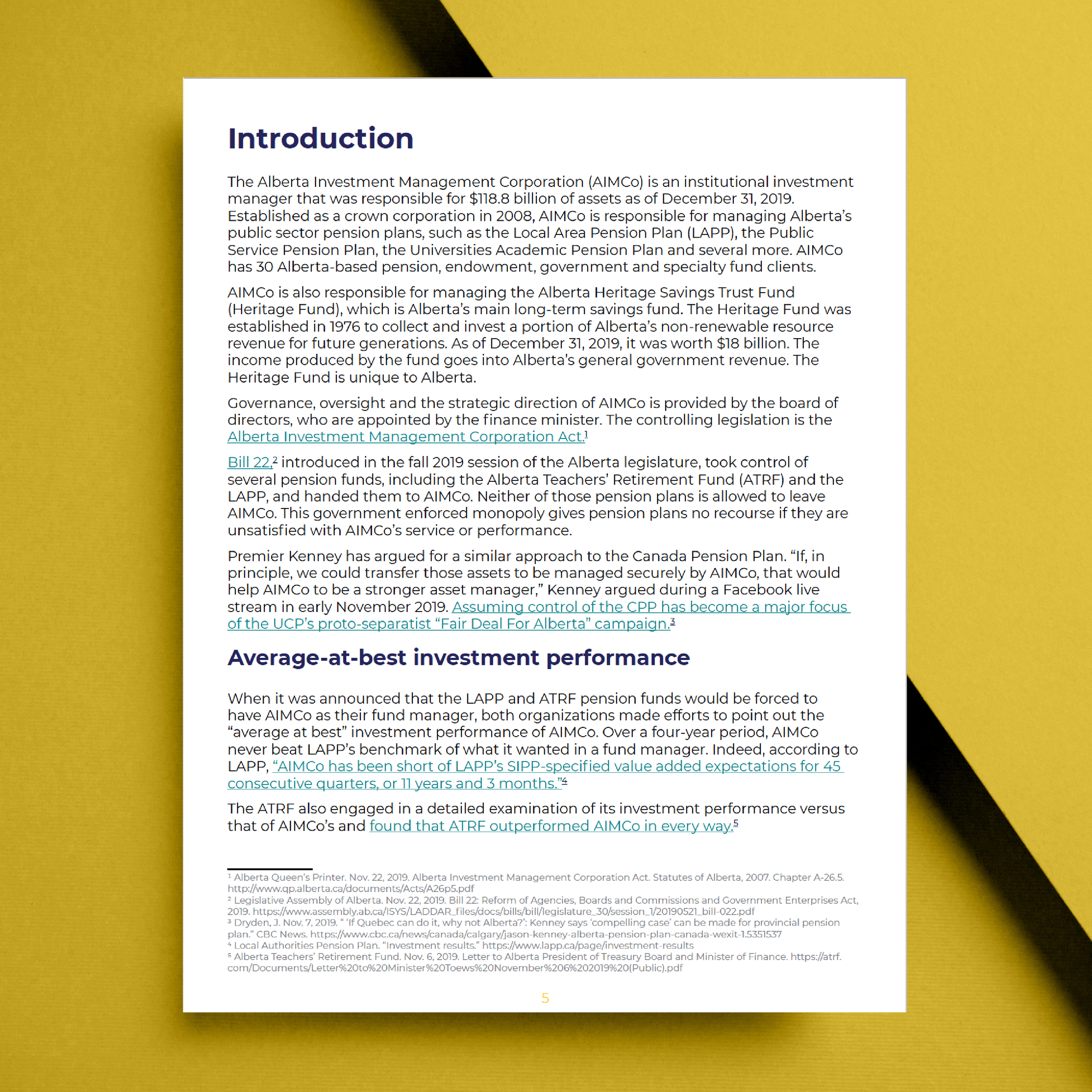
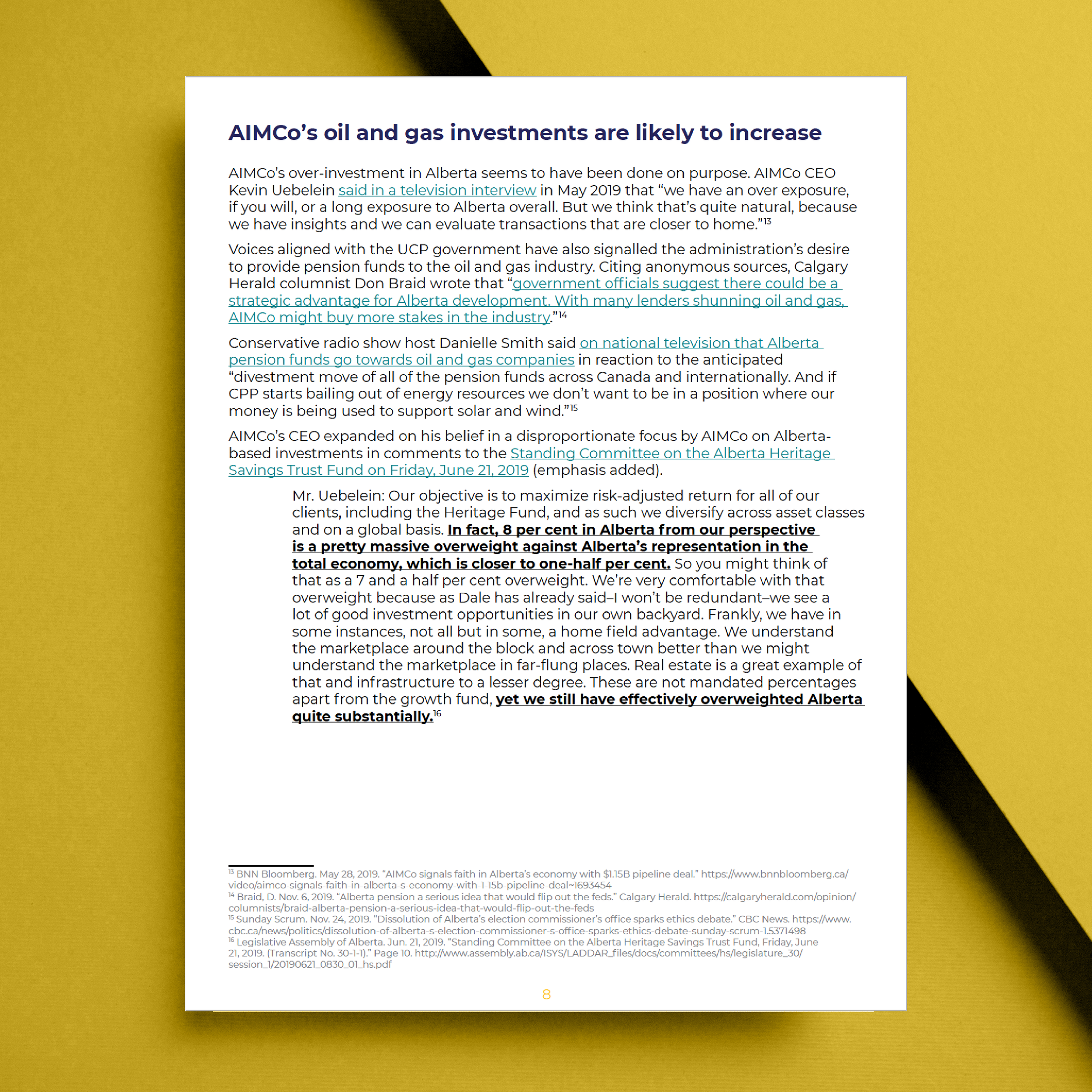
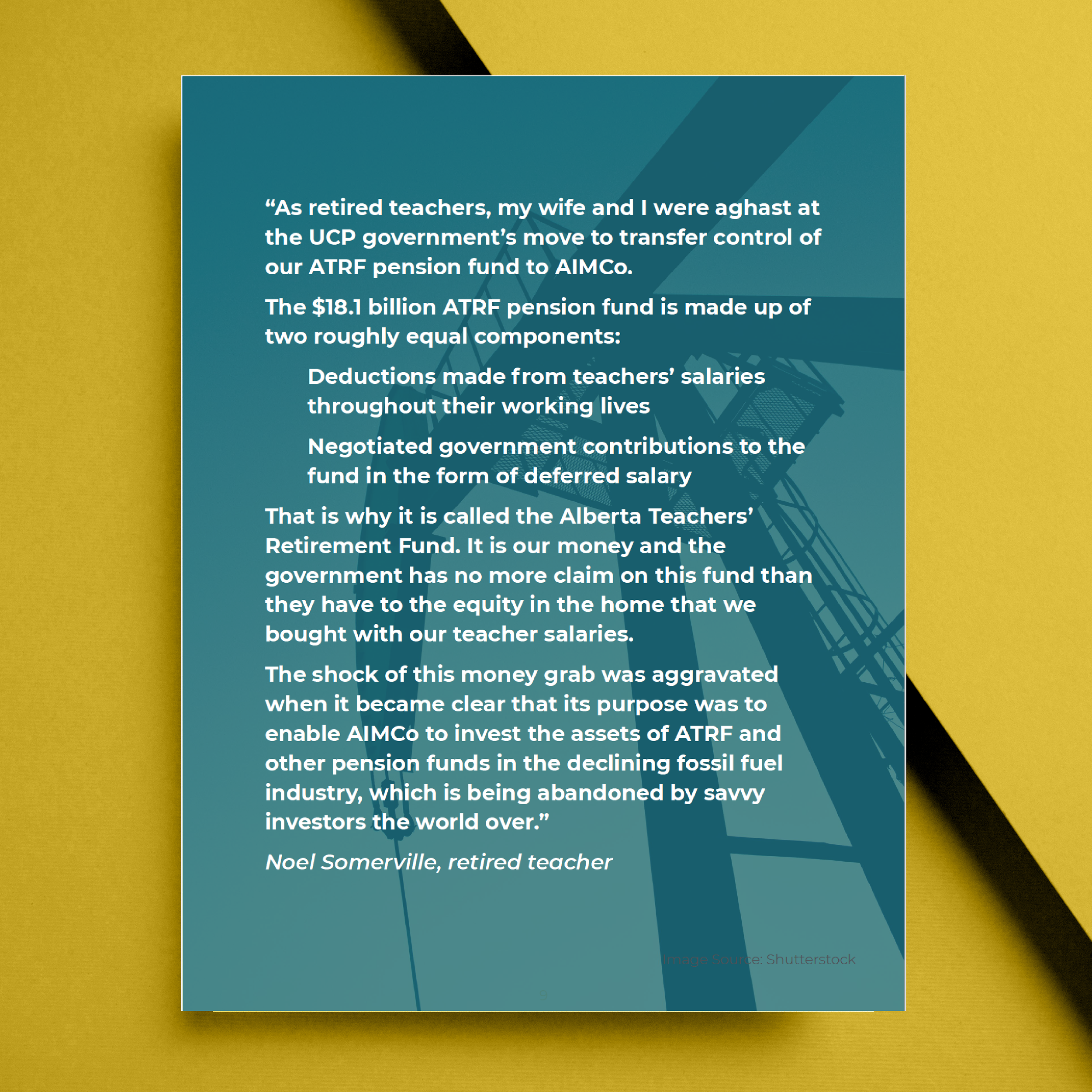
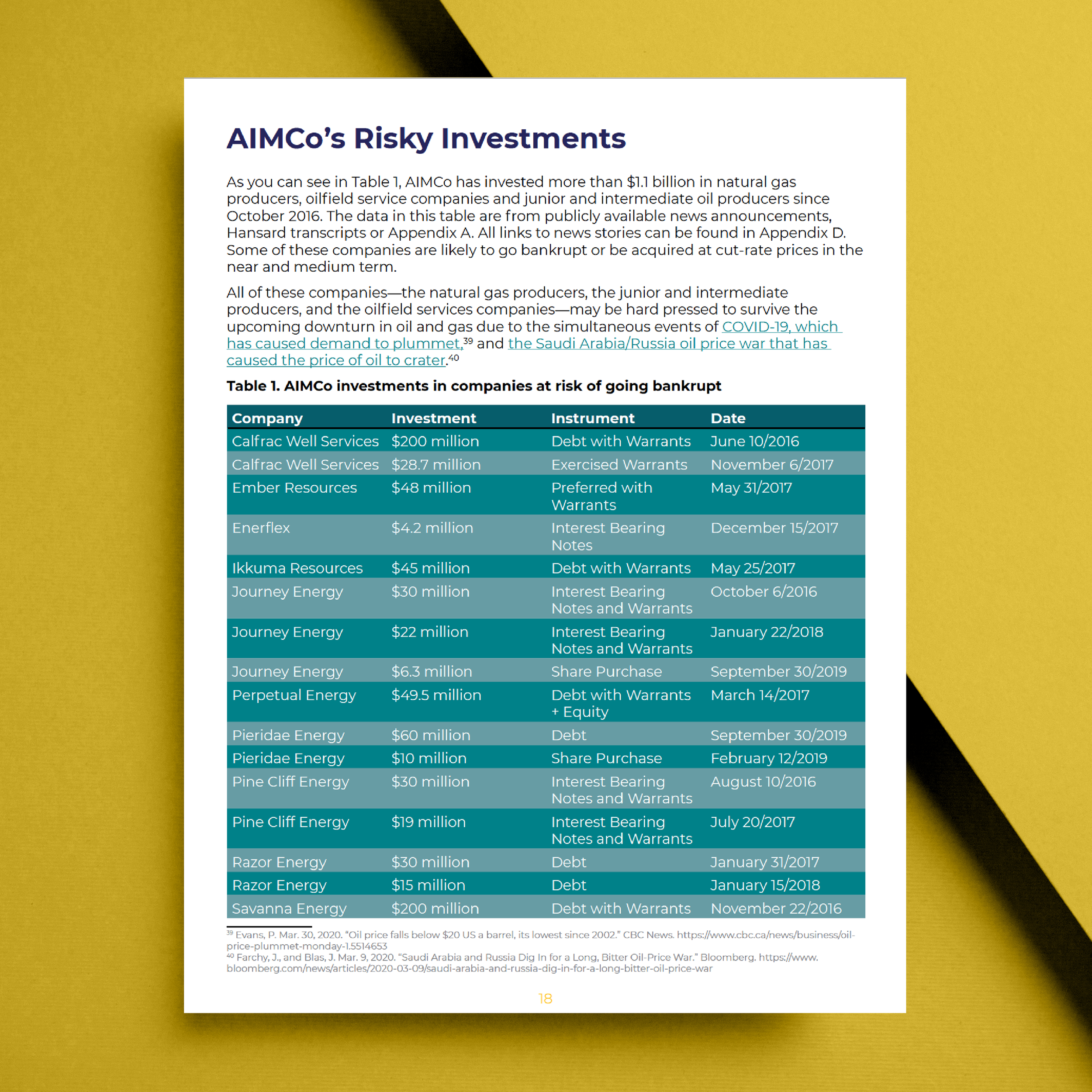
AIMCO Report